Employer
ReSupply (freelance)
Platform
Desktop, mobile
Areas
UX, UI, IA
Duration
1 month
UX/UI designer
As the sole designer on this freelance project, I led research synthesis, translated insights into actionable design improvements, built and tested a prototype, and delivered final designs—all while managing client communication and presentations.
UX/UI designer (me) and my client
ReSupply, one of Goodwill's largest donation facilitation services, offers pickup and delivery on behalf of Goodwill Industries. Donors list items they want to give, and for a fee, ReSupply handles pickup and drop-off to a local Goodwill donation center.

Understanding needs
Analyze user data and conduct stakeholder discussions to identify key UX and visual design challenges, ensuring alignment with user expectations.

Evaluating & remapping
Analyze the existing user flow to uncover inefficiencies, address logic gaps, and streamline interactions for a more intuitive experience.

Design & iteration
Translate research insights into a high-fidelity wireframe prototype, facilitating rapid testing and iteration with users and stakeholders to refine usability.

Final design & handoff
Build out mockups based on validated wireframes, ensuring accessibility and usability best practices before delivering the final designs and documentation.
To improve the donation experience, I started by digging into and sorting user data provided by the client. The majority of ReSupply's users (about 75%) were between 40 and 70 years old, mostly homeowners looking to declutter. Many weren't able or willing to just throw things away, so paying for a pickup service was their best option.
I also noticed a strong preference for desktop, with 70% of users donating from a larger screen. This meant clarity and ease of use on desktop were crucial, but the mobile experience still needed to be smooth for those donating on the go. These insights shaped my approach as I analyzed the existing donation flow, looking for pain points, inefficiencies, and ways to simplify the process.
"The downsizer"
Homeowners in their 40s to 70s looking for a hassle-free way to declutter. Rather than discarding items, they preferred donating, but needed a simple, reliable process. With most using desktop vs mobile, clarity and ease of navigation were essential.
"
"

I'd rather donate my things than throw them away, but it has to be straightforward and easy to arrange.
To optimize the donation experience, I began by analyzing the existing user flow and screens to uncover inefficiencies and address any logic gaps. During this analysis, I identified that the steps were ordered in a suboptimal way, preventing users from discovering their eligibility early in the process. This not only risked wasting their time but also created frustration when users had to move through multiple stages before realizing they weren't eligible.
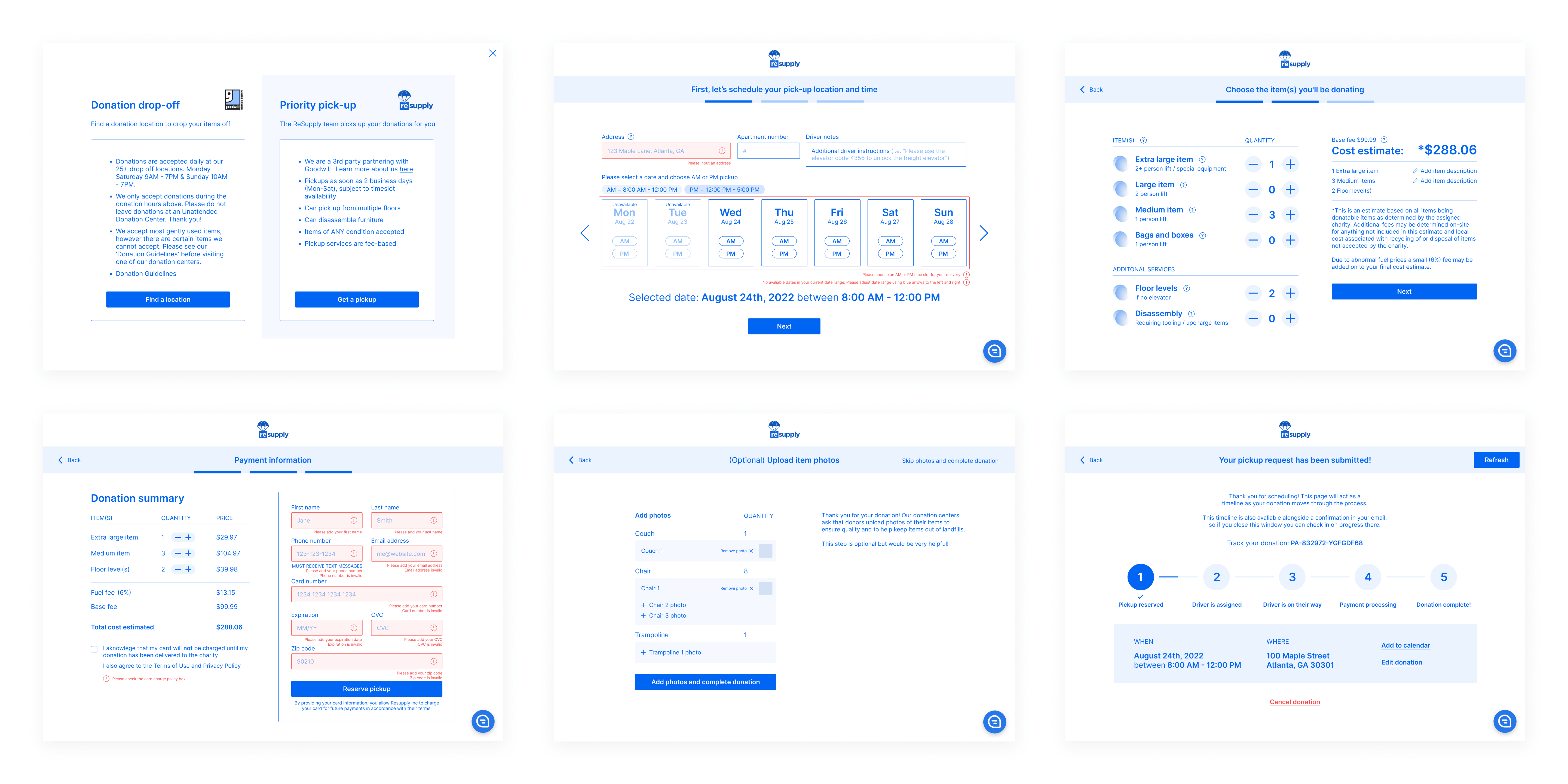
Original mobile screens (for a consolidated view of entire flow)
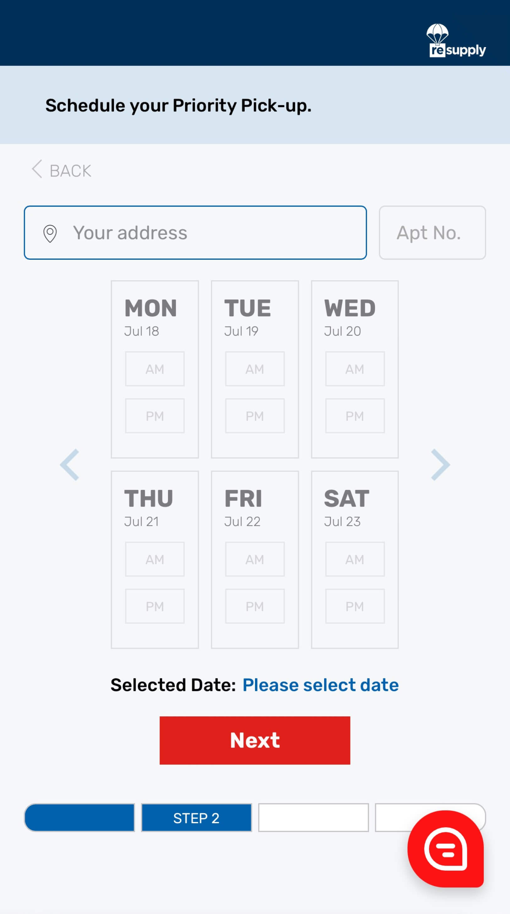
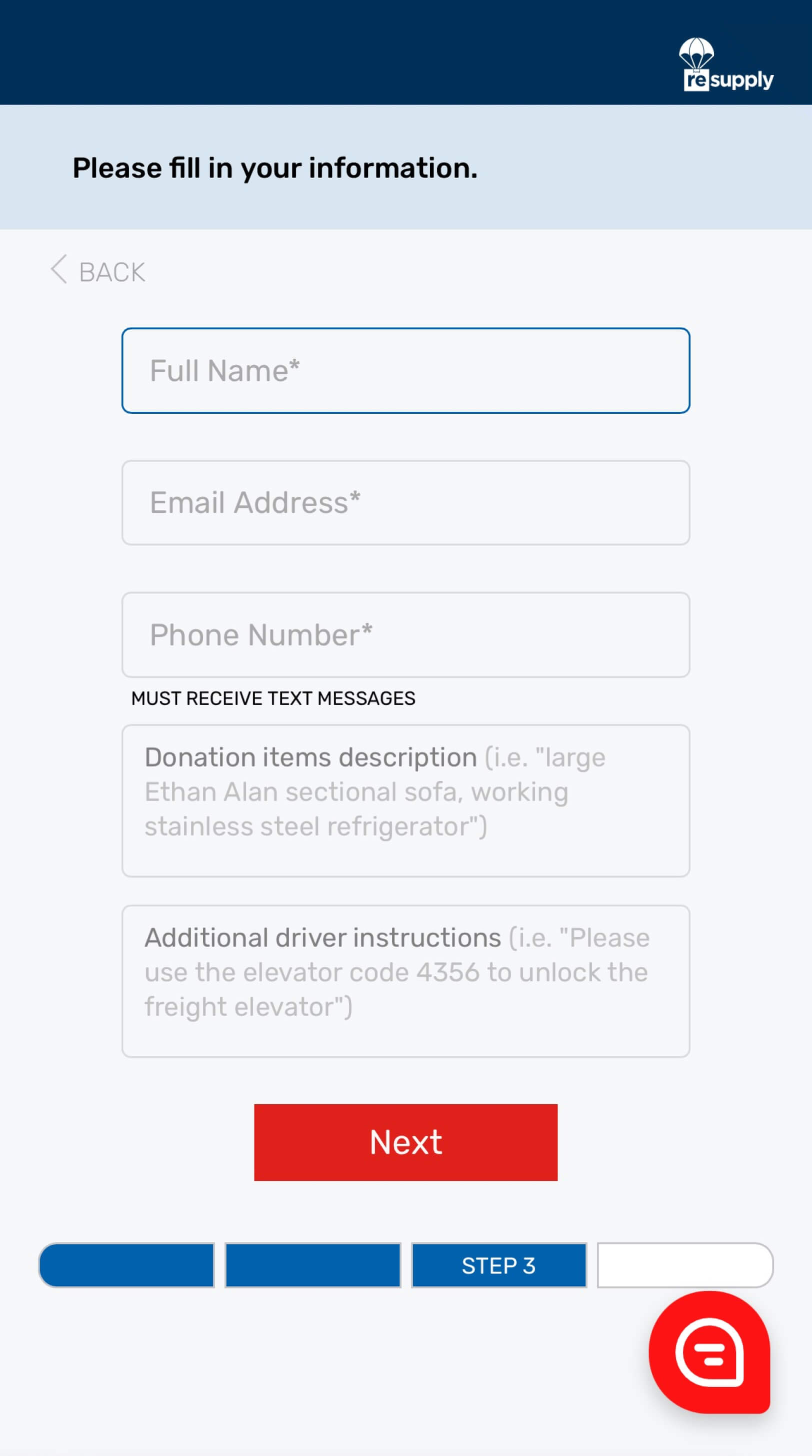
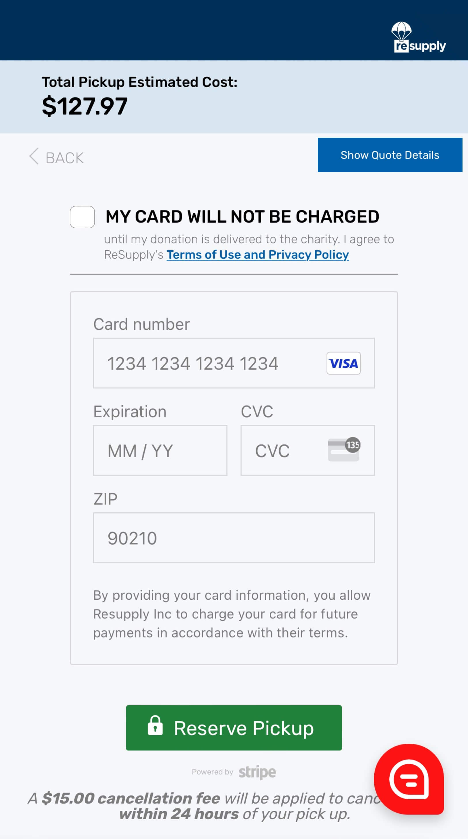
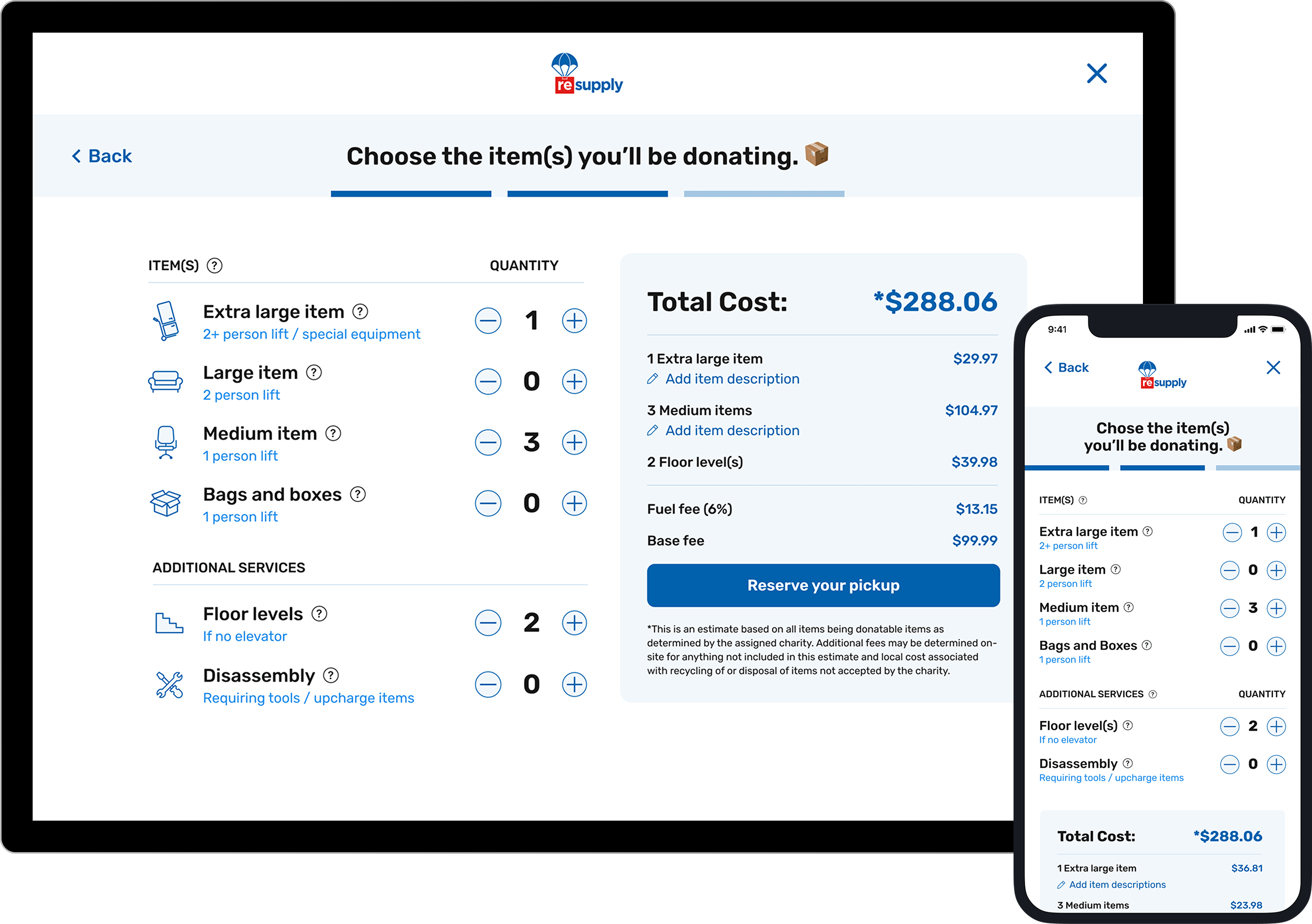
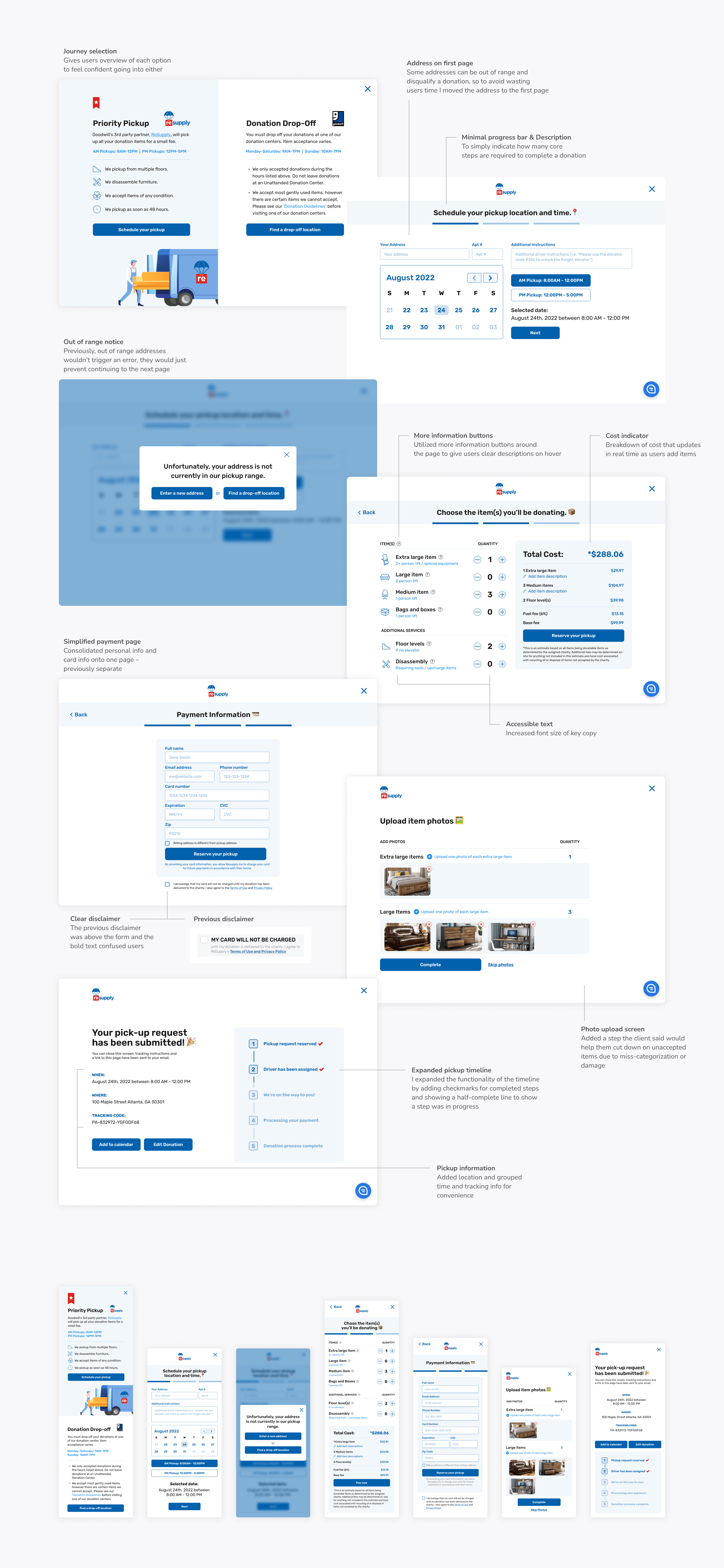
I redesigned the flow to prioritize eligibility checks earlier, ensuring users could quickly determine whether they qualified for donation pickup. By placing this step upfront, I minimized wasted time and set clear expectations from the start. Additionally, I added steps to clarify ReSupply's offering and distinguish it from Goodwill's free donation service. This helped users understand the differences between the two services and made the process more intuitive overall, streamlining the interaction and enhancing the overall user experience.
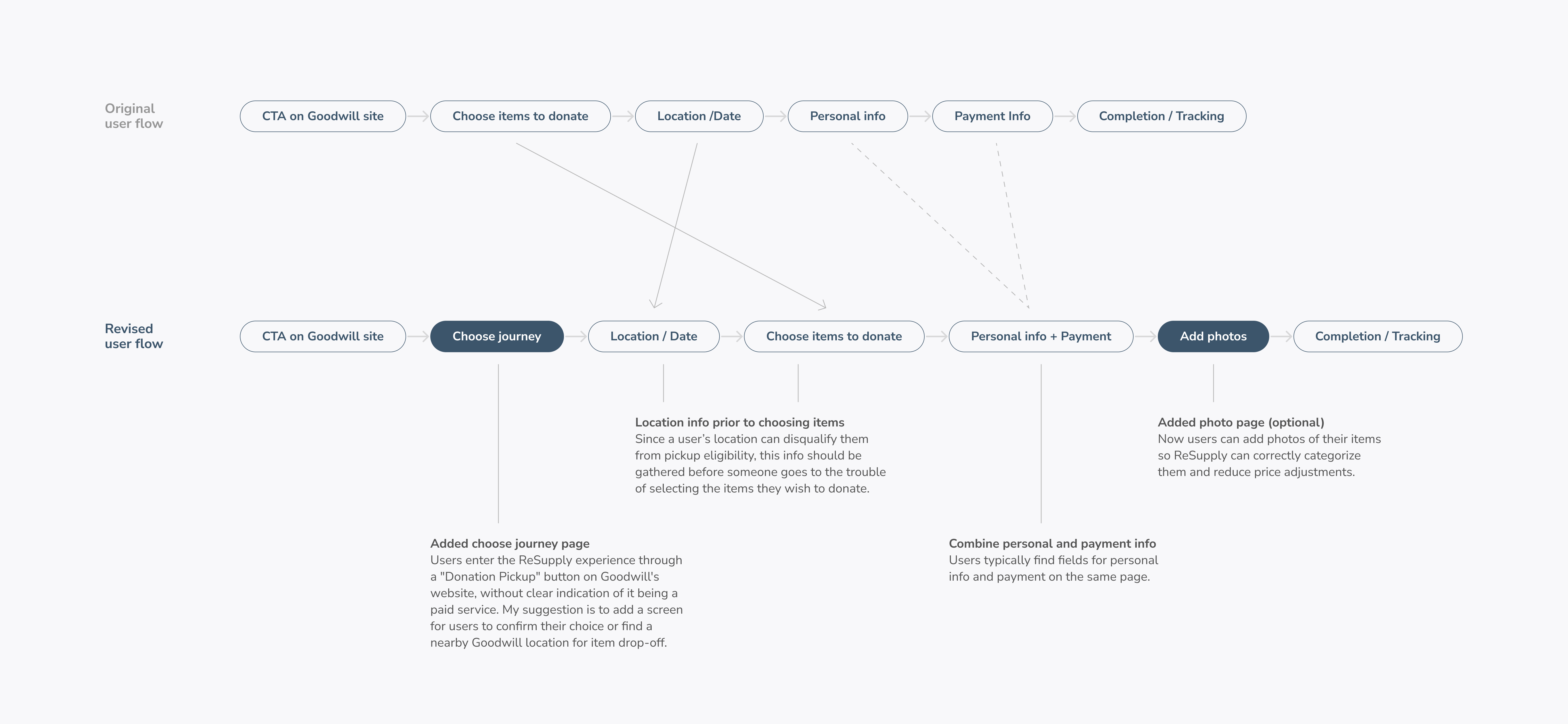
Redesigned user flow
I opted for a high-fidelity prototype in Figma to quickly facilitate discussions with stakeholders and gather flow insights from users.
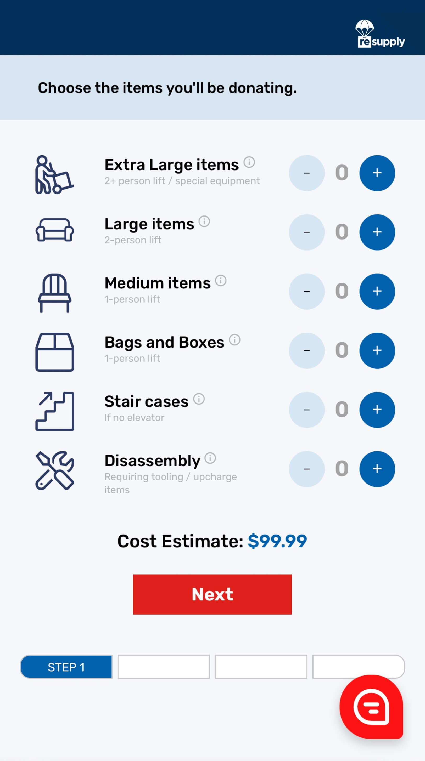
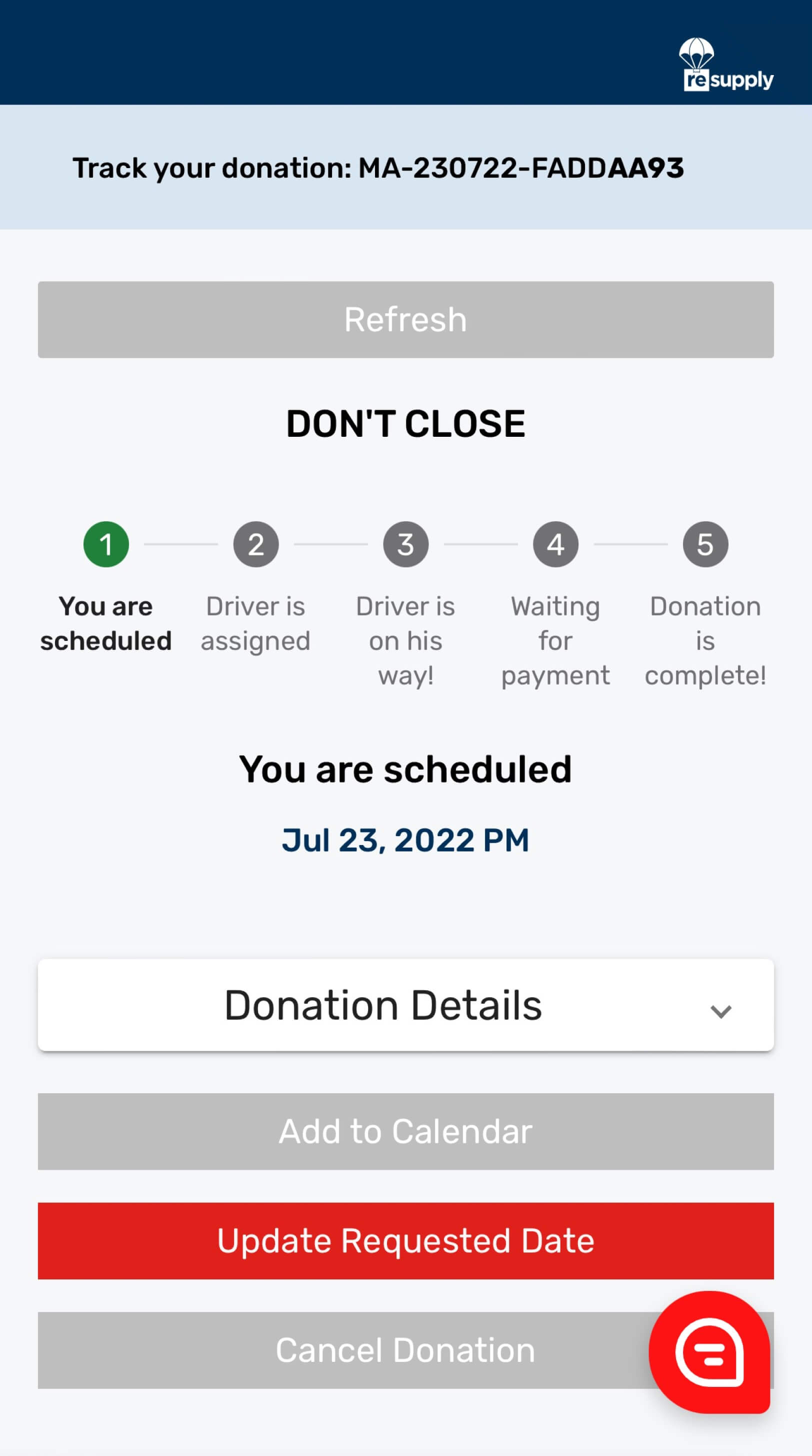
A key issue was the lack of feedback, particularly around errors or eligibility, which could lead to confusion, especially for older users. To address this, I added clear, actionable error messages and alerts to clarify eligibility and service details, guiding and empowering users throughout the process.
These updates were crucial for reducing cognitive load, improving clarity, and ensuring a smoother, more intuitive donation experience.
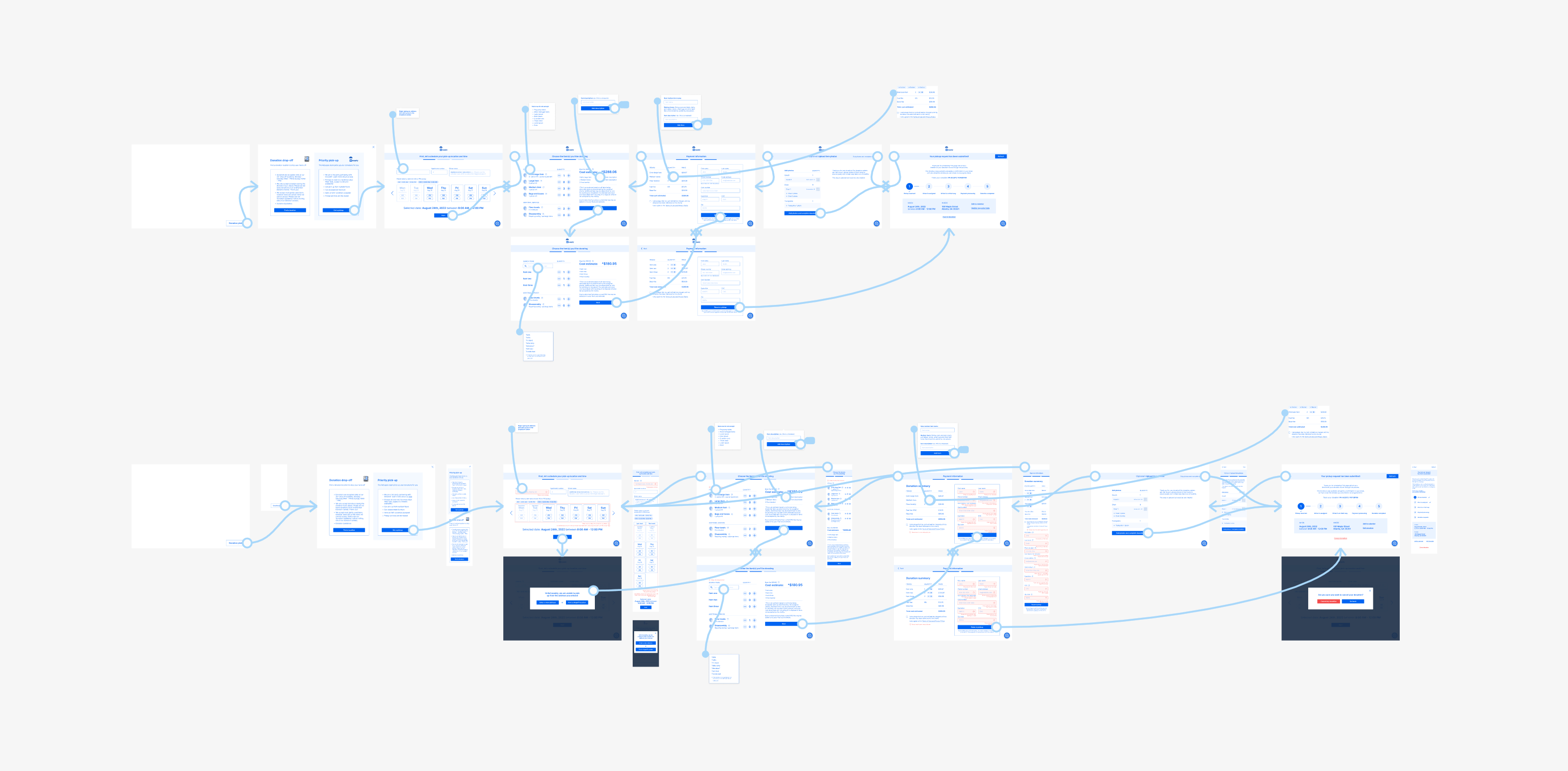
Post-revision wireframes and error flow
The wireframe prototype helped identify user journey and UX writing issues early on, allowing for iterative improvements without overcommitting to visual details. This streamlined the revision process and enabled me to move efficiently into final visuals, focusing solely on refining the look and feel.
The final mockups elevated ReSupply's branding while ensuring all UX and visual enhancements carried over seamlessly to the mobile experience.
For next steps, I'd focus on gathering more user feedback through usability testing to validate the changes made in the flow and error messaging. This would help ensure that the new design not only resolves the pain points but also meets the expectations of our primary user group. Additionally, further refinements to the UI could be made based on this feedback to optimize accessibility and clarity. Finally, collaboration with the dev team for a smooth handoff and post-launch monitoring would be key to ensure the new flow performs well in real-world scenarios.
Managing scope creep was a crucial aspect of this project. Initially, I lacked clarity around the required timing and deliverables, which made it challenging to plan effectively. Through this project, I learned the importance of allocating buffer time for tasks with unclear time estimates to avoid delays. I'd be nothing without my PMs, I gained a greater appreciation for the role they play in balancing timelines and expectations. ❤️